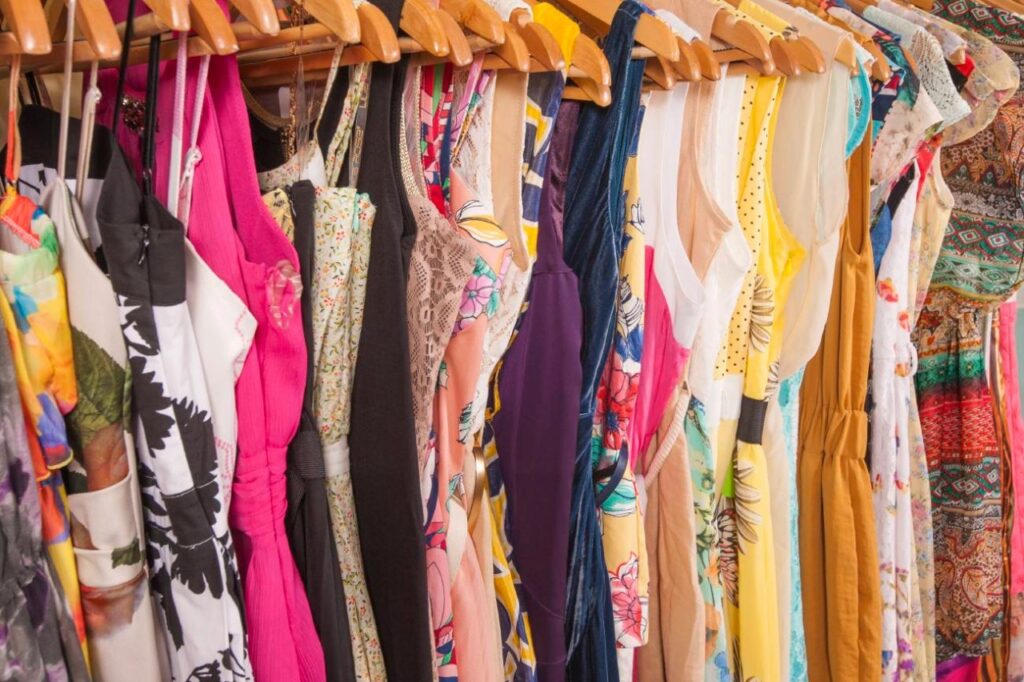
The latest fashions for the summer include combining pastel colors with vibrant colors. From bright colors and Emerald green, to delicate shades. the latest season’s design combines organic ingredients with trendy style. To appreciate the beauty of beautifully bright colors, use the Color of the Year. This classic neutral feels a little more sophisticated than a plain and is one of the easiest to style. Adopting these hues can help you draw luck and pleasant energy.
Colors That Will Design Summer Style in 2025:
1. Yellow butter:
Yellow Butter is a soft, warm, and sunny color which reflects the rich, creamy texture of fresh buttery. These soft, buttery tones offer a soft, sunny glow that is beautiful.
2. Mocha Mousse:
Mocha mousse is a warm, comforting brown with hints of pink that evoke rich chocolate or creamy coffee. In a chaotic environment, the color is meant to convey peace, comfort and a comfortable feeling of luxury. Mocha Mousse is a stylish neutral that looks great on clothing.
3. Powder Pink:
There is a delicate because romantic charm to this lovely pastel color. Imagine blossoming flowers and softly focused memories. Powder pink, a pastel that feels indifferent yet serene, embodies peace. Dress it with black and white for a polished look, or combine it with navy, green, and turquoise for a vibrant, balanced outfit. This color radiates warmth, evokes caring emotions, and reflects classic beauty with a bold, fashionable edge.
4. Minty Green:
This shade of green is very specific unique & cool, calming, and energizing. Minty Green has light blue undertones and appears as a light to medium pastel green. It motivates and comforts. It blends the peace of blue with the brightness of green. The shade includes several specific details. Its elegant, discreet nature suits simple layouts.
5. Tangerine:
The vibrant orange colour of tangerine promotes comfort and energy. It can be used to provide comfort life, and a spirit of bright positivity to the environment, clothing, or design. Tangerine is a color that promotes force, creativity, confidence, warmth, and boldness and it promotes passion and artistic expression. In Asian cultures, especially Chinese ones, tangerines are also linked to wealth and good fortune.
6. Sunset Coral:
This shade, which combines calm reds, beautiful oranges, and soft pinks, is a pleasant colorful, and emotionally rich example of a summer sunset. It’s positive, welcoming, and often creates feelings of romance, comfort and tropical energy. Bright and motivating without being harsh. Inspires playful expression and joy and many more emotional attachments.
7. Blurred Berry:
Blurred Berry is trending as a subtle and wearable berry tone. this is the perfect example of that joyful, romantic strawberry hue—rich and delicate, timeless and fresh. Perfect for adding some color without going too. goes well with warm neutralizes like soft mauve in color taupe, or ivory. Think about using a similar approach for a complete look: blur berry on the lids, cheeks, and lips for the unity with little work.
8. Neutral grey:
Among the spectrum’s most emotionally and aesthetically stable hues is neutral gray. Since it doesn’t lean warm, neutral grey is regarded as a pure grey because it has equal proportions of red, green, and blue. When layered or textured, neutral grey looks its finest. In the absence of appropriate accents, it may also come across as chilly, lifeless, or repetitive.rarely goes out of style and fits in with any trend or time period.
Most Trending Color In Summer 2025:
. Emerald Green:
this is an elegant, deep shade of green that reflects the value of the priceless emerald. Emerald green naturally creates vibrant life, growth, and new life because it reflects the freshness of spring and the producing power of nature. Emerald Green is a great emotional and visual aid. It exudes elegance, represents natural power, and cultivates a sense of grounded calm whether it uses in branding, home design, or fashion.
. Wispy Pink:
This softly delicate pink color has been referred to as a warm neutral or a sign of elegance. In interior design, wispy pink is utilized to create a peaceful and feminine decor. Its delicate color performs well as a warm neutral, creating a gentle background that goes well with a variety of design patterns. Its pink color is soft and delicate, just as Wispy Pink.
. Pistachio:
a soft, fresh, and subtly vibrant green color. Like springtime and new growth. Pistachios warm green tone comes from the nut’s shell and flesh, making it a natural, organic inspiration that’s both cozy and lively. Unlike greens, pistachio soothes the mind but still feels fresh and awake. Pistachio is on many skin tones, offering a fresh, youthful glow.
Quickly Style Tips:
| Combination | Effect |
|---|---|
| Butter Yellow + Mocha Mousse | Warm, grounded look with soft contrast |
| Powder Pink + Sky Blue | Romantic and serene |
| Tangerine or Aperol Orange | Bold, energetic, perfect for accents |
| Metallic Silver + Pastels | A modern, glamorous twist |
Read More Related Articleshttps://trendythreads.net/the-top-summer-fashion-trends-2025/


